Rolls-Royce unveils new brand identity, Purple Spirit signature colour – now calls itself a ‘House of Luxury’
Rolls-Royce has unveiled a new brand identity that’s more modern, and more in tune with both the digital world and its now younger client demographic. Also, the Goodwood carmaker is now calling itself a “House of Luxury” instead of just an automotive manufacturer.
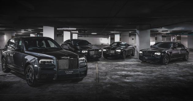
According to Rolls-Royce, it has of late experienced change at a quicker rate than ever before. The brand’s portfolio has expanded to five models, and almost every car created is bespoke. The introduction of Black Badge has answered the call for an edgier, alternative R-R, “one that carries an assertive and dominant persona,” Rolls-Royce says, adding that the age of its clients have decreased to an average of just 43.
“As the marque’s digital presence increases, there has never been a more important time for the visual language of the company to reflect our standing as the leading luxury brand in the world. We have embarked on a fascinating journey of modernising our brand identity to echo those changes seen in our portfolio, our client demographic, their lifestyle and the luxury world that surrounds them,” Rolls-Royce CEO Torsten Muller-Otvos explained.
Rolls-Royce appointed Marina Willer, partner at multi-disciplinary design studio Pentagram, to create a new brand identity that encapsulates the brand’s presence and standing as a House of Luxury. The identity was designed to appeal to the new demographic of clients and all that they represent, digitally and physically.
Pentagram embarked upon a deep dive into Rolls-Royce, including its products (both new and old), design ethos, designers, items that are sacrosanct to the marque, and the unique relationship Goodwood maintains with its clients. They also spent time in the factory, understanding the essence of bespoke.
“What soon became apparent is that Rolls-Royce has evolved from being regarded as an automotive manufacturer into a leading light in the world of luxury. It was essential for us to ensure that the brand’s new identity reflected this shift. We needed to present Rolls-Royce in a forward-facing, fresh and relevant way – speaking to new audiences while respecting the company’s loyal clients,” Willer commented.
She was able to approach the redesign from a fresh perspective. “I do not come from an automotive background. This vantage point provided me with the opportunity to observe Rolls-Royce as a manufacturer of luxury products. My ambition was to celebrate the luxuriousness of the brand while providing it with the means to visually communicate with Rolls-Royce’s younger, increasingly diversified audiences,” she said.
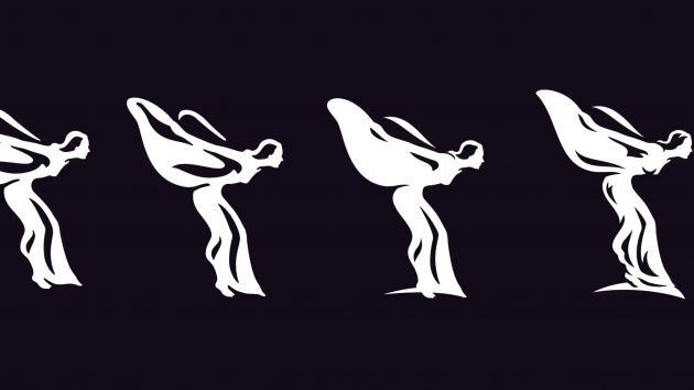
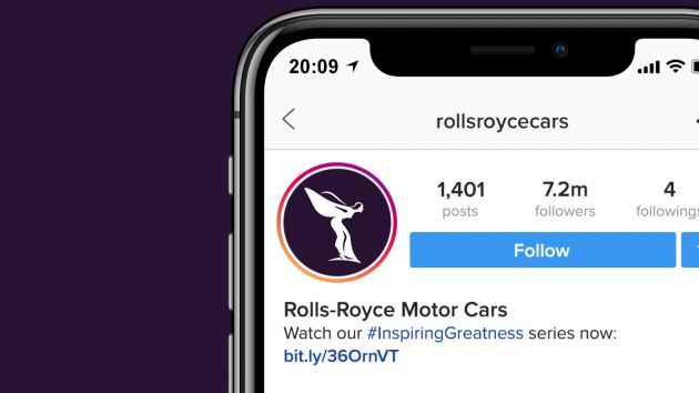
Let’s start with the brand’s iconic Spirit of Ecstasy sculpture. Having graced the prow of Rolls-Royce cars since 1911, she will remain unchanged, but the Spirit of Ecstasy will now gain increased prominence in the marque’s brand identity. This will be done via an illustration, a distilled form of the statuette. When depicted in 2D form, her direction is from left to right, “boldly facing the future”.
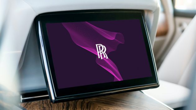
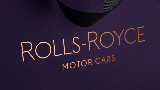
You would have noticed the deep purple backgrounds here, and the colour was chosen out of a desire to seek a more expressive, luxurious colour palette, one appealing to both male and female clients. “Historically rare in nature and with roots in mythology, art, piety and royalty, purple has always signified wealth and power,” R-R says, and with that, Purple Spirit will be its signature colour. A metallic rose gold was chosen to complement the purple, but only on printed material.
The double R “Badge of Honour” remains unchanged, but from now, is reserved solely for the creations of the Home of Rolls-Royce in Goodwood, which has to be the cars. The monogram – just the double R without the Rolls-Royce wording – also retains its original form but replaces the Badge of Honour on collateral.
However, the wordmark ‘Rolls-Royce Motor Cars’, as found above the door of the marque’s establishments, was found to be corporate and unrepresentative of the House of Luxury the brand wants to be. Pentagram uncovered typography in the marque’s archives from the 1930s and used an art-deco style as the basis of a new wordmark. The words ‘Motor Cars’ have reduced in size, with the emphasis reverting to Rolls-Royce. Note that the two Rs are ever slightly more prominent.
Pentagram’s design team explored multiple typefaces in search of a font that depicts luxury, without being overtly decorative. The chosen typeface, Riviera Nights, stems from the same family as Gill Sans Alt, the marque’s previous font, but with additionally crafted and bevelled letters.
Lastly, to tie all the above together is a new visual treatment of the Spirit of Ecstasy, called The Spirit of Ecstasy Expression. Akin to silken fabric, The Expression adopts a fluid form and is versatile in nature, adding a “cutting-edge aura” to the new visual identity. A digital tool that uses coding has been developed by Pentagram to enable The Expression to be used on any surface, from projection to embroidery, printing to engraving. It will be found in both physical (at showrooms) and digital forms.
There you go, different logos for different items, all connected in one new brand identity. If all of the above doesn’t make much sense to you, at least you’ll agree that the new visuals look both modern and luxurious.


GALLERY: Rolls-Royce Cullinan Black Badge in Malaysia


The post Rolls-Royce unveils new brand identity, Purple Spirit signature colour – now calls itself a ‘House of Luxury’ appeared first on Paul Tan's Automotive News.
from Paul Tan's Automotive News
Read The Rest:paultan...



Post a Comment